
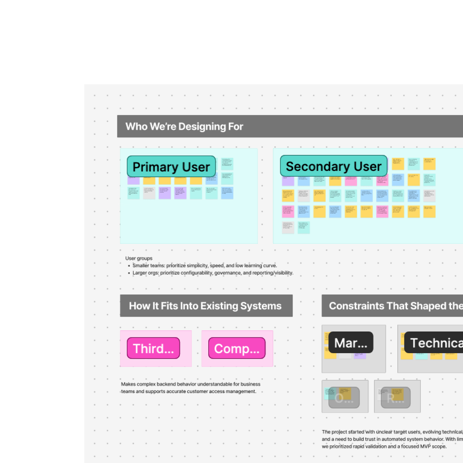
Building a Rule Builder for Non-Technical Users
Led 0→1 UX for a B2B payment recovery product, turning complex logic into a guided rule builder
B2B
Saas
UX Strategy


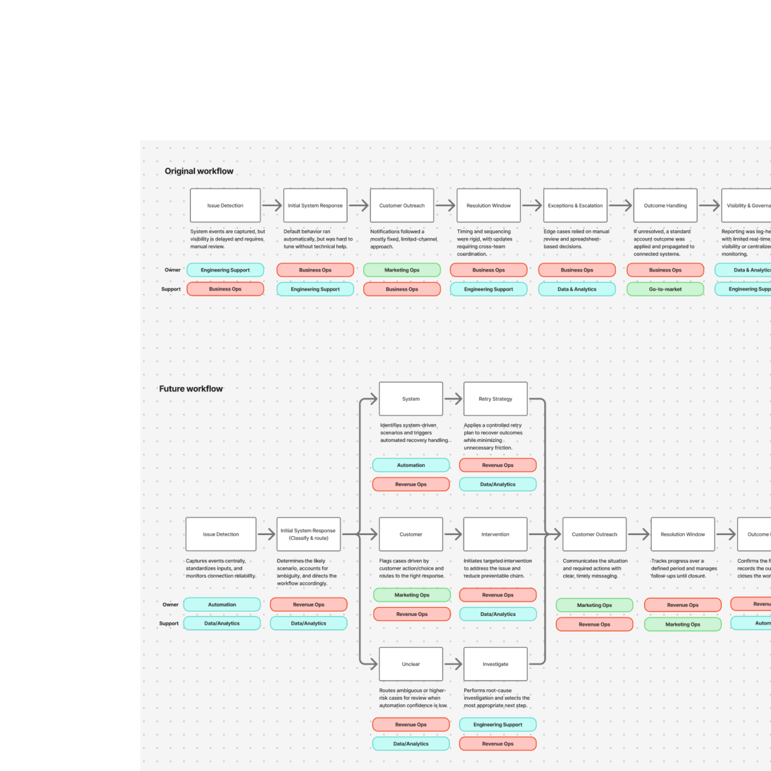
A Scalable UX for an API Platform
Redesigned API key management for clarity, usability, and accessibility.
Enterprise UX
Usability Testing
Accessibility
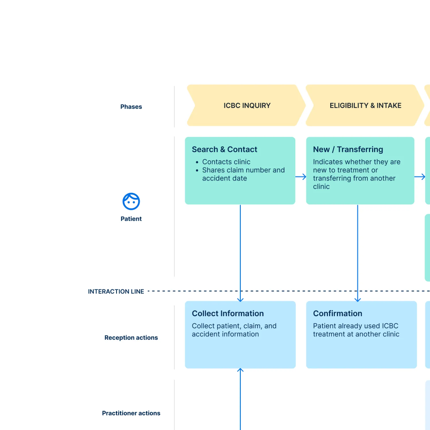
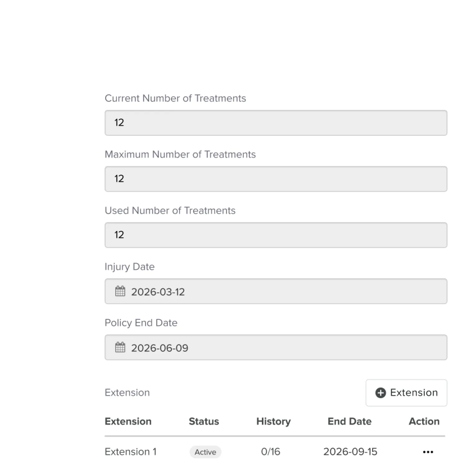
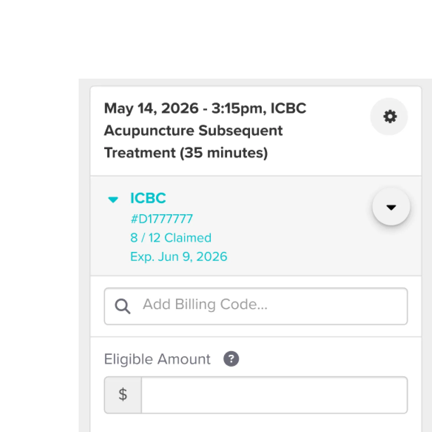
Designing Operations for a Growing Clinic
Improved intake and front desk workflows from inside a growing clinic.
Service Design
Healthcare
Growth


.svg)
Password required
Making Retirement Planning Intuitive
Redesigned retirement planning workflows for an insurance platform.
B2B
Tablet App
Usability Testing


